To understand and predict the price movements of a specific currency pair, you need to analyze their price charts. We will probably be here all day if we go through all the different charts you could find in the forex markets. And most of them are not exactly helpful or easy to understand. Let’s look at the three most popular types of forex charts and how to read them.
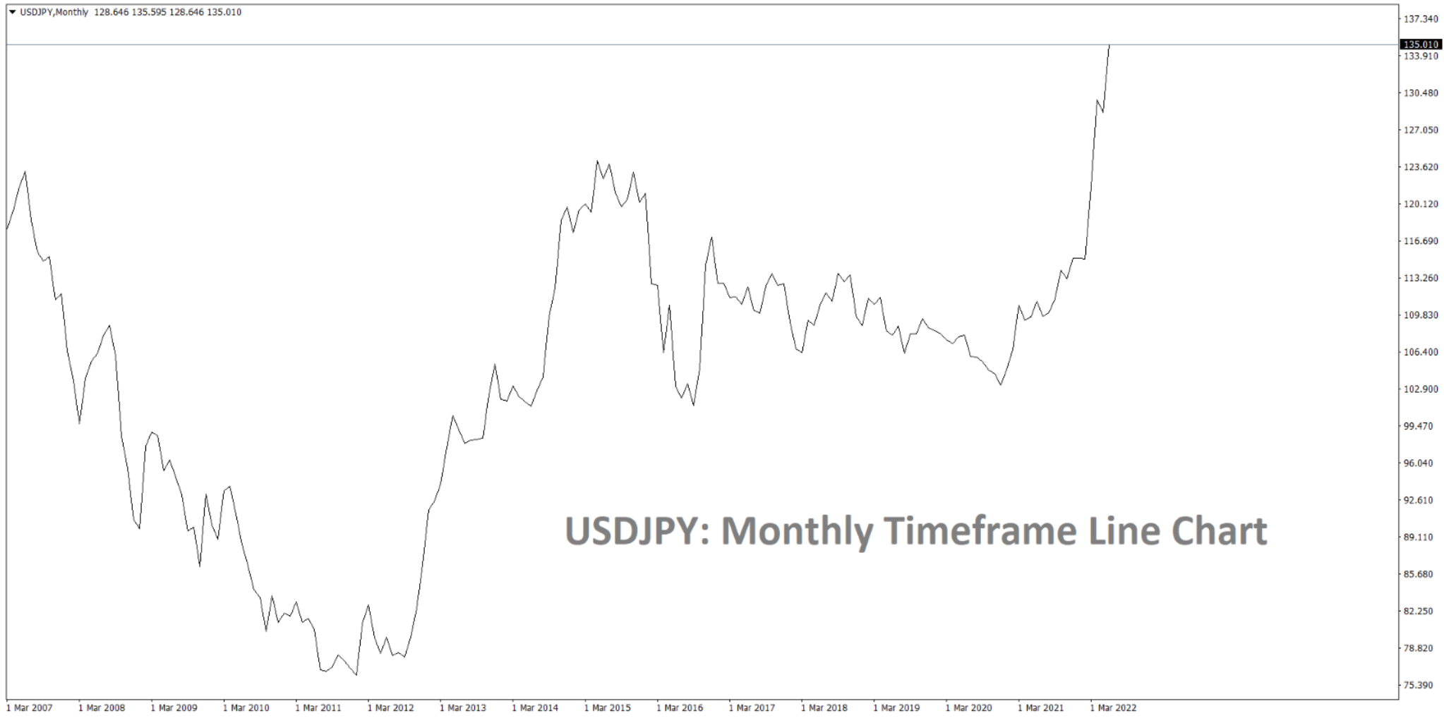
Line Chart
Starting off with the line chart is the simplest of the three standard forex charts we will be looking at today. A line chart simply represents one closing price to the next closing price over time. This chart doesn’t give much information that could help you with technical analysis. It helps understand the overall direction the market is shifting towards.
If we look at the chart below, we’ll see the line chart of the USDJPY forex pair on the monthly timeframe chart. As you can probably tell, there isn’t much to look at. The most you can probably gather from this chart is the overall sense of market direction. In this case, we can tell that the USDJPY pair is currently at one of the highest points it has been at in quite a while.
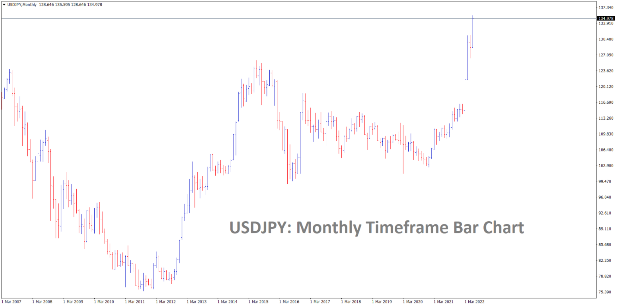
Bar Chart
A bar chart gets a little more complicated than your average line chart. However, this is probably the least used of the three standard charts in the forex space. With the help of a bar chart, you will be able to gather the highs and lows and the opening and closing values of any bar in the chart. This chart helps determine each period’s price range in a timeframe.
Looking at the chart below, we will see the bar chart on the USDJPY forex pair in the monthly timeframe. If you look closely, you’ll notice lines at the side of each bar. The left line represents the opening price, while the right line represents the closing price. The bottom represents the lowest traded price, while the top represents the highest traded price.
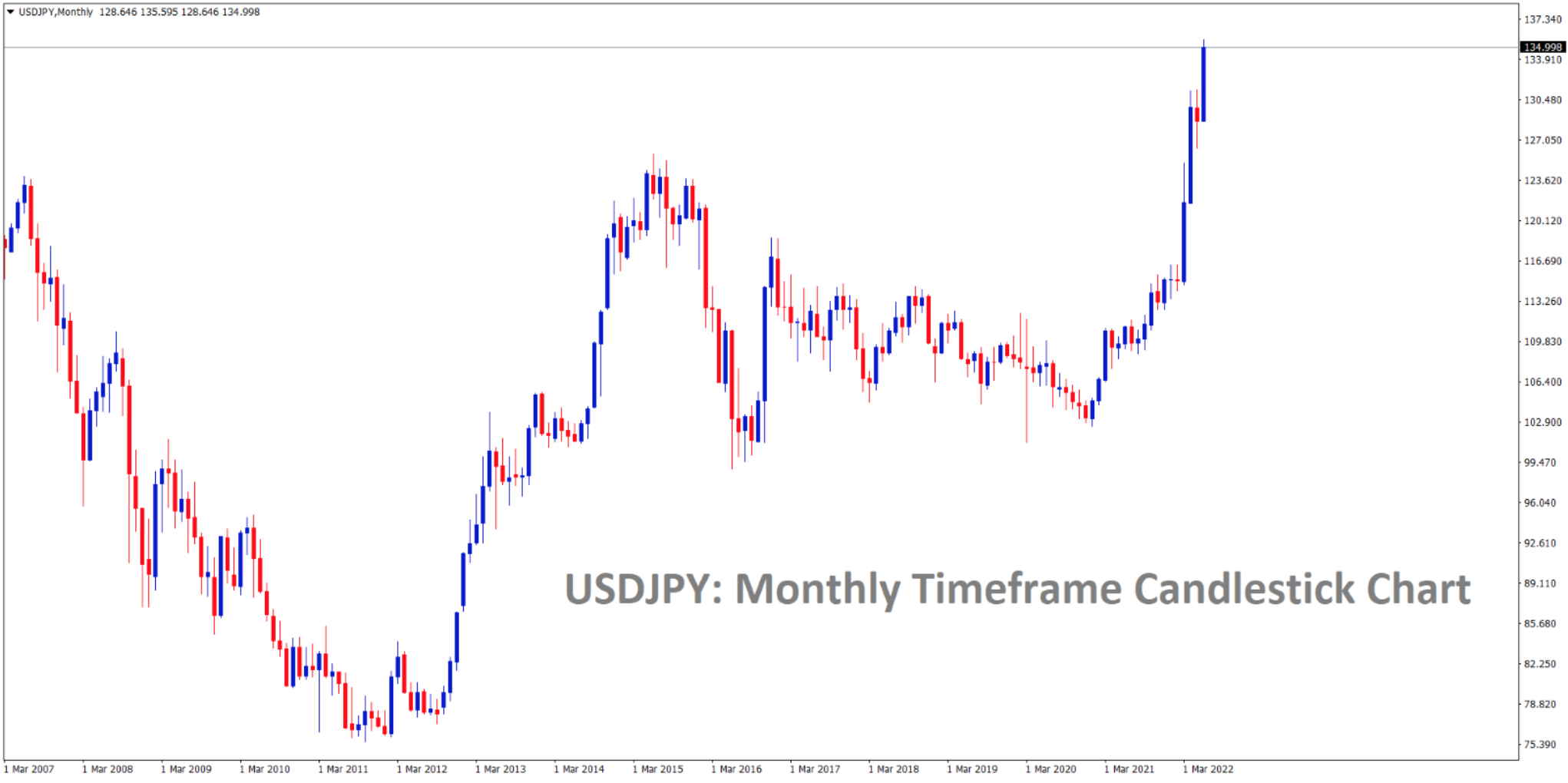
Candlestick Chart
Finally, the candlestick chart is the most widely used chart type in the forex industry. This chart type is also the most technical of the three. As a plus point, this chart is also the prettiest of the three! This chart is preferred over the others as it is much easier to read. The mechanics behind this chart are similar to the bar chart, just in a different design.
Looking at the chart below, we’ll see the candlestick chart for the USDJPY forex pair in the monthly timeframe. Zooming in, we’ll notice that each candlestick has a middle body. It is essential to know that if the body is blue, it means the candlestick opened at a higher price than the previous close. Similarly, if the body is red, the candlestick opened at a lower price than the previous close. The rest is pretty much the same as the bar chart.